Custom Pages
Custom pages let you add your own screens to the device's Web Console. You design them in the AppBlocks editor by placing components on a canvas, and the device serves them next to the built-in Dashboard, Settings and Database pages.
A custom page can:
- Show variables and settings as text, stats, badges and progress bars.
- Change variables and settings from inputs and buttons.
- Run commands in your application.
- Read, add, edit and delete rows of data tables, and chart them over time.
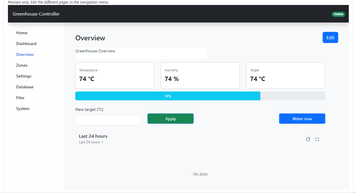
Custom pages are available for projects that use the Zephyr runtime, with the Web Console feature enabled.
How custom pages work
You design pages in the editor. When you build the application, the pages are packed into the Web Console that the device serves. In the browser, the page reads values from the device and sends changes back through the device's web API.
Opening the page editor
- Open the Features step and select Web Console in the Dashboards category. Make sure Web Console Enabled is set to Enabled.
- In the console preview on the General tab, click Pages in the left menu. Once you have pages, each one is listed there by name.
- Click Edit. The page editor opens in its own tab.
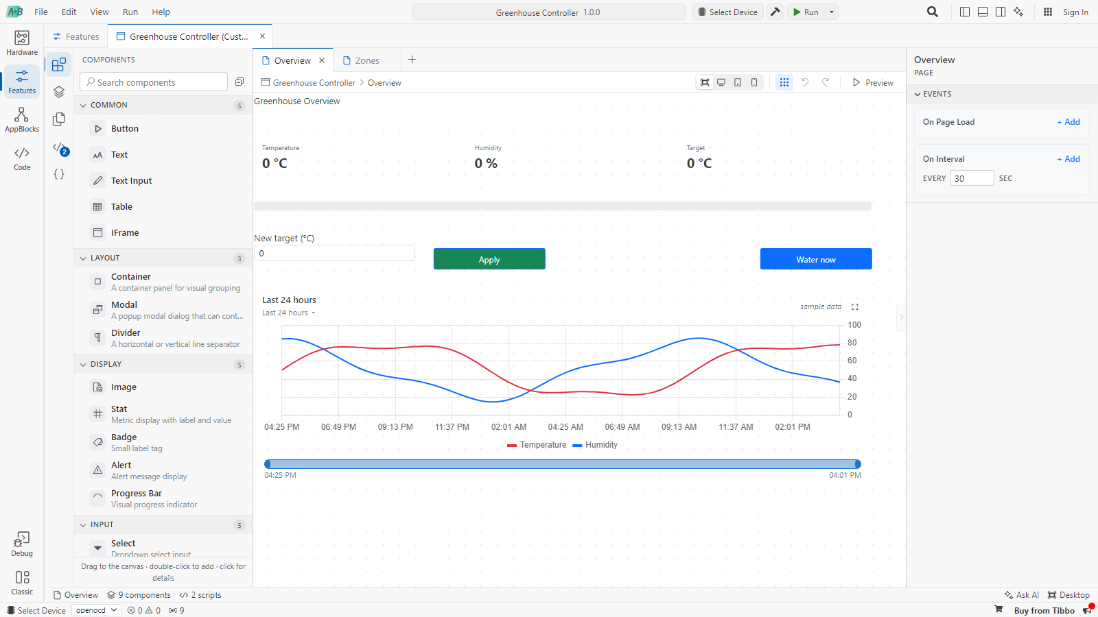
The editor has four areas:
- The activity bar on the far left switches the side bar between Components, Layers, Pages, Scripts and State.
- The canvas shows the page. Page tabs above it switch between pages; click + to add one and double-click a tab to rename it. The toolbar sets the preview width, shows or hides the grid, undoes and redoes, and starts the preview.
- The properties panel on the right shows the selected component, or the page when nothing is selected.
- The status bar shows the page, the number of components and scripts, and the layout you are editing.
Changes are saved to the project automatically.
Adding components
Drag a component from the Components library onto the canvas, or double-click it to add it. Drag components to move them and use their edges to resize them. Components snap to a 40-column grid, so a page reflows when the browser window is narrower or wider.
| Group | Components |
|---|---|
| Common | Button, Text, Text Input, Table, IFrame |
| Layout | Container, Modal, Divider |
| Display | Image, Stat, Badge, Alert, Progress Bar |
| Input | Select, Checkbox, Date Picker, Number Input, Text Area |
| Navigation | Link, Tabs, Nav Pills |
| Data | JSON Viewer, List, Time Series Chart |
| Advanced | Custom (JSX), for your own React component |
Container, Tabs and List hold other components. A List repeats its child components once for each item of its Data array; inside it, use {{item.field}} and {{index}}.
The Modal, Text Area and Date Picker components currently appear in the editor preview only. On the device they are shown as Unknown. Use Number Input, Text Input and Select for device pages.
Select a component to edit it. Its properties panel has up to four sections:
- Properties: what the component shows, such as a label or value.
- Styles: colors, borders and padding.
- Events: what happens when the user interacts with it. See Events and actions.
- State: the component's current values while the page runs, such as the text typed into an input.
Click the component's name at the top of the panel to rename it. Scripts and bindings refer to components by name, so give the ones you'll use meaningful names such as SetpointInput.
Showing live values
Any property can contain a binding: a JavaScript expression between double curly braces. The expression is evaluated when the page runs and whenever the values it uses change.
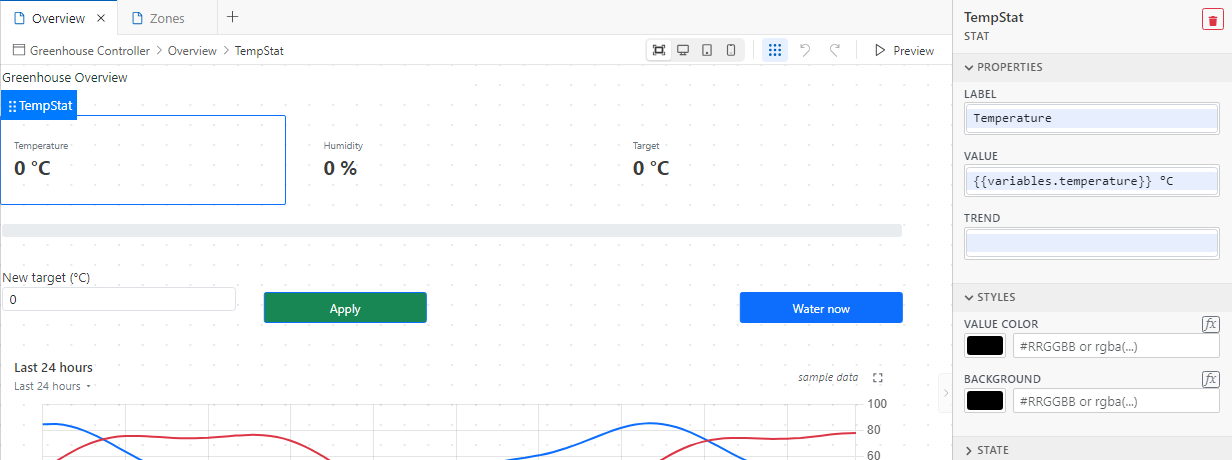
A binding can be the whole value or part of a text:
{{variables.temperature}} °C
{{variables.humidity > 80 ? 'danger' : 'success'}}
{{components.SetpointInput.state.value}}
These names are available in bindings and scripts:
| Name | Contains |
|---|---|
variables | Every project variable, including setting and hardware variables, by name. For example variables.TEMP_SETPOINT. |
components | Every component on the page by name, with its properties, styles and state. For example components.SetpointInput.state.value. |
scripts | Every script by name, with its last result in data, and loading and error. |
globals | Values your scripts store with setGlobal. They stay in the browser and are never sent to the device. |
tables | The tables available to the console, with their fields. |
commands | The project's commands. |
page | The current page. |
item, index | Inside a List: the current item and its position. |
The editor preview uses sample values (0 for numbers, empty text). Real values appear on the device.
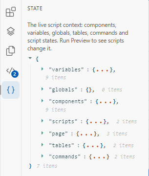
The State view shows the whole context that bindings and scripts see:
Events and actions
Components such as Button, Select, Checkbox, Number Input, Tabs and Image have events. Click + Add next to an event to add an action; an event can run several actions in order.
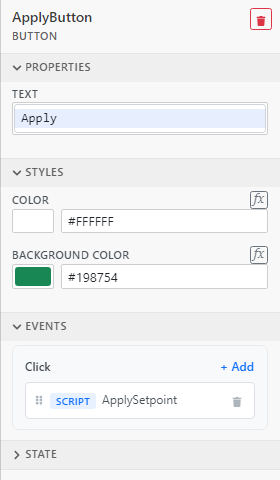
Click an action to change it:

| Action type | What it does |
|---|---|
| Show Alert | Shows a message box. |
| Run Script | Runs one of the page scripts. |
| Run JavaScript | Runs a short piece of code typed right in the action. |
| Navigate to Page | Opens another custom page. |
| Open Modal / Close Modal | Shows or hides a Modal component. |
The page itself has two events. Click an empty area of the canvas to see them:
- On Page Load runs when the page opens.
- On Interval runs every n seconds while the page is open (30 by default).
Scripts
Scripts hold the logic of your pages: writing to the device, querying tables, and anything more than a single expression. They are written in JavaScript, shared by all pages, and run in the browser.
Open the Scripts view and click + to create one, or click a script to edit it:
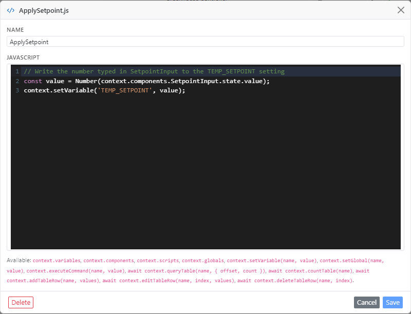
Scripts receive a context object with the names listed in Showing live values and these functions:
| Function | Does |
|---|---|
context.setVariable(name, value) | Sets a variable on the device. For a setting's variable, the setting is saved. |
context.executeCommand(name, value) | Runs a command in your application, triggering its On Command block. |
await context.queryTable(name, options) | Returns rows of a table as objects keyed by field ID, plus _index. options can set offset, count, filters and order. |
await context.countTable(name) | Returns the number of rows. |
await context.addTableRow(name, values) | Adds a row. values is an object such as { zone: 'North', duration: 600 }. |
await context.editTableRow(name, index, values) | Changes the row with the given _index. |
await context.deleteTableRow(name, index) | Deletes the row with the given _index. |
await context.clearTable(name) | Deletes all rows. |
context.setComponentState(name, key, value) | Changes a component's state, for example to fill in an input. |
context.setGlobal(name, value) | Stores a value for other scripts and bindings on this browser. |
context.runScript(name) | Runs another script. |
Filters are written as { field: value } for equality, or as a list of conditions such as [{ col: 'duration', op: '>', value: 300 }] with =, !=, <, <=, > or >=. The device accepts up to four conditions per query. Queries with filters return at most 100 rows unless you set count.
For example, this script adds up the watering time of all active zones and stores it in a global. A Stat with the value {{globals.totalMinutes}} min then shows the result:
const rows = await context.queryTable('zones', {
    filters: [{ col: 'duration', op: '>', value: 0 }],
});
const seconds = rows.reduce((sum, row) => sum + Number(row.duration), 0);
context.setGlobal('totalMinutes', Math.round(seconds / 60));
Run it from the page's On Page Load event so the total is ready when the page opens.
Writing to the device (setting variables, running commands and changing tables) requires the Web Console administrator account. Configure accounts in Web Console › Advanced.
Charting table data
The Time Series Chart plots numeric fields of a data table over time. Point it at a table, choose the field that holds the time, and add a series for each field to plot:
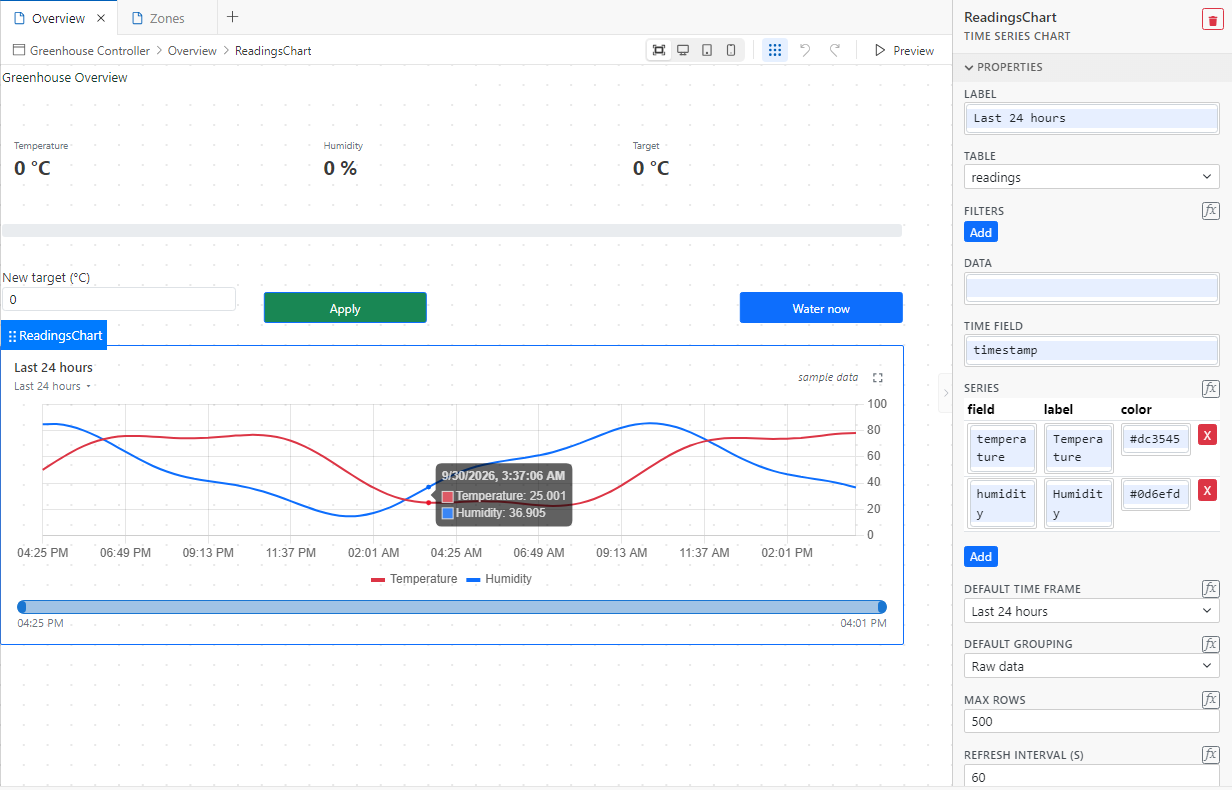
| Property | Description |
|---|---|
| Table | The data table to read. |
| Filters | Extra conditions for the rows, in addition to the time frame. |
| Time Field | The DateTime field that places each row on the time axis. |
| Series | The fields to plot, each with a label and color. |
| Default Time Frame | The initial range, from the last 5 minutes to the last 7 days, or all data. Users can change it on the chart. |
| Default Grouping | Raw data, or averages per minute, hour or day for long ranges. |
| Max Rows | The most rows to read per refresh (10–5000). |
| Refresh Interval (s) | How often the chart reloads. 0 reloads only when the user asks. |
Leave Table empty to chart the array in Data instead, for example the result of a script.
A Log table with a DateTime field, filled by a Table Insert Row block, is the usual source. See Data Tables for an example.
Layouts for tablets and phones
The toolbar's width buttons preview the page at Desktop (1200 px), Tablet (768 px) and Mobile (375 px) widths. The desktop layout is the base. When you move or resize a component while previewing Tablet or Mobile, you create an override for that size only, and the toolbar shows Editing Mobile overrides.
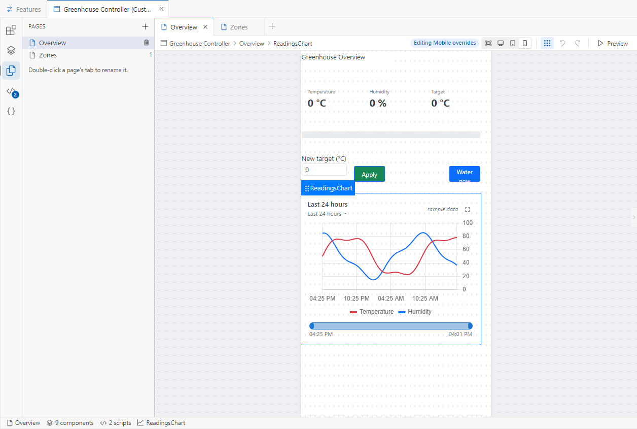
Previewing
Click Preview to run the page in the editor: bindings are evaluated, events fire and scripts run. The editor has no connection to a device, so variables keep their sample values, tables are empty, and writes only change the preview. Click Stop preview to go back to editing.
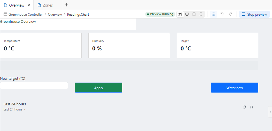
To try the page with real data, upload the application and open the device's Web Console.
Keeping values up to date
A page reads the device's variables when it opens, and again after a script sets a variable or runs a command. Reload the page in the browser to see values that changed on the device in the meantime. Charts reload on their own Refresh Interval, and scripts can read tables at any time, for example from the page's On Interval event.
Keyboard shortcuts
| Shortcut | Action |
|---|---|
| Ctrl+Z | Undo |
| Ctrl+Shift+Z or Ctrl+Y | Redo |
| Ctrl+D | Duplicate the selected component |
| Delete or Backspace | Delete the selected component |
On macOS, use Cmd instead of Ctrl.